What do you know about data visualization? If you are new to the topic, then be our guest in this article. We are going to be giving you a gentle introduction into the world of data visualization and discussing some of the popular data visualization tools in the market.

There is no denying that data has become important more than ever in human history – likewise, is the generation of required data. While data is important to data scientists, researchers, businesses, and government, it needs to be transformed into a format that is understandable and can be communicated clearly and effectively. The need for transforming data into an understandable form led to the birth of data visualization. With data visualization, you can transform complex data, look simple, and easily understand, which helps in the improvement of the decision-making process.
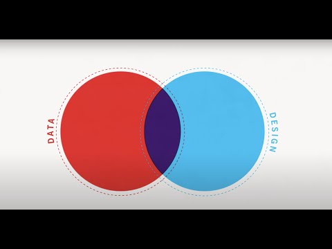
As a data scientist or anyone that deals with data, one of the most important skills you should acquire is the data visualization skills. Data visualization is much more than just representing your data in an understandable format using statistical graphs; you also need to make sure they are visually appealing. This might look difficult at first, but with some data visualization tools in the market, it comes pretty simple. We are going to discuss some of these data visualization tools. Before that, let take a look at data visualization in detail.
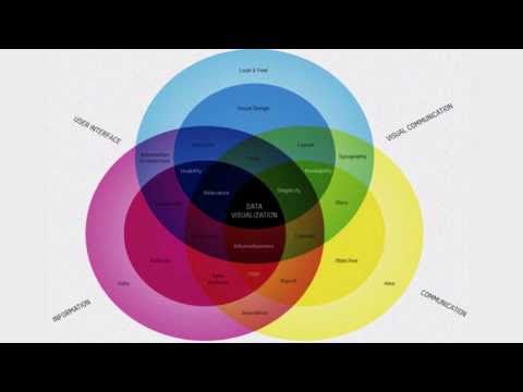
What is Data Visualization?

In simple words, data visualization is a technique used by data scientists and analysts to communicate data by encoding it as visual objects (bars, lines, dots, etc.) contained in graphics. It involves representing large datasets into visual graphics,which is done to allow the easy understanding of the complex relationship between and within datasets. Data visualization is often loosely referred to as statistical graphics, information graphics, and even information visualization. The practice is usually the first in data analyst projects.
Data visualization makes use of statistical graphs, bars, charts, plots, and visually appealing graphics to represent data. The practice has been around for a while now – with the Turin Papyrus Map known as the first data visualization piece. This Egyptian map dated back to the 1160 B.C and was used for expressing the distance between quarries. The map also depicts the size of the stone quarried. From this primitive map, data visualization has grown into what we have today.
Why Do We Use Data Visualization?
Just like every other technique used in data science, data analyst makes use of data visualization to achieve some goals. These goals are discussed briefly below.
-
Makes Understanding of Dataset Easy
From the beginning of this writing, we already made mention of this. The major reason why data is visualized is to make it understandable and easy to comprehend. Even if you have the requisite skill, you wouldn’t want to comb through a long spreadsheet of data – and if you do, you will find it difficult trying to make sense of it quickly. What visualization does to your data is that it summarizes it and represent it in easily understood formats.
-
Makes Information Memorable
As humans, we have the capability to memorize visual information in pictorial formats than we can for written information. One of the ways to amplify the information a data portrays is to convert it into a piece of summarized visual information. You will agree with me that data presented in a visualized format is the easiest to memorize.
-
Speeds Up Your Decision-Making Process
When making a data-based decision, data visualization can help speed up the process. However, when using data visualization for a decision-making process, you need to know that if the visualized data is distorted, there is a high chance that you will be making a wrong decision since the visualized data is wrong.
Read more,
Best Data Visualization Tools
There’s no doubt that data visualization makes the understanding of large datasets easy. But what can you use to convert a large dataset into a scannable visual format? With the use of data visualization tools, converting large datasets into eye-catchy graphic designs that are informing becomes easy.
There are a good number of data visualization tools in the market. In this section of the article, you are going to be learning about some of the best in the market meant for programmers and non-coders.
Data Visualization Tools for Non-coders
Some data visualization tools come as standalone applications you can use to generate data visualizations. Many of these applications have been designed to ease the work of data scientists and analysts. Even without knowing how to write codes or design beautiful visuals, you can generate production-ready visuals by using any of these apps. These applications are described below.
Tableau
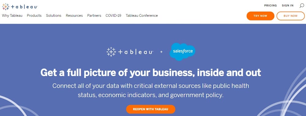
Tableau is arguably one of the most popular data visualization tools in the market. The Tableau service is available for a host of platforms, including desktop and online. With this data visualization tool, you do not need any special training to present your data in a visually appealing format. Tableau is a non-profit paid tool. However, they have a public Tableau version that is free to use. Even with the free version of the tool, you can carry out impressive data visualization tasks.
Among some of its features, you’ll come to appreciate the extensive gallery of infographics and visualizations provided as a template that will save you time and make your work look more professional. Another feature of Tableau you’ll like is its data import features, as it supports data import from hundreds of sources, including CSV, Salesforce data, and Google Analytics data, among other sources. Tableau is also perfect for creating data visualization with map integration.
Microsoft Power BI
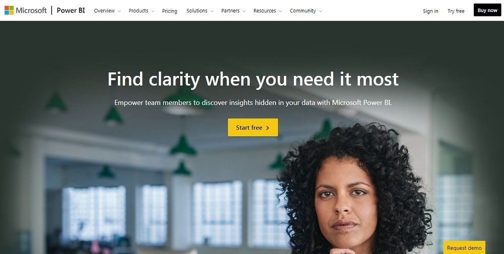
If you’re looking for a tool that integrates best with Microsoft tools, then the Microsoft Power BI should be top on your list. Whether you’re an individual or a business looking to gain deeper insight into data, this Microsoft tool has got you covered – and if you’re an individual, it comes free of charge with no price tag. You can use this software to generate interactive data visualizations. And what makes it one of the preferred options is that it is available on both desktop and mobile.
The Microsoft Power BI business intelligence tool provides an easy to use interface for creating reports and dashboards. This tool comes with smart tools such as built-in AI support, custom/pre-built connectors, and tight excel integration, among others. Your data is protected against data loss and secured even when exported.
Datawrapper
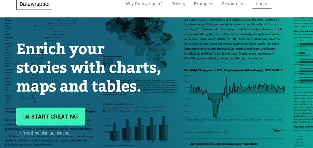
If you have the minimal technical knowledge, but you’re looking for a data visualization tool you can use to present your data with professional taste, Datawrapper is the tool for you. Datawrapper is arguably one of the easiest in terms of the learning curve. This tool is meant for creating beautiful maps, charts, and tables. While Datawrapper seems to be an easy and simple tool, it might interest you to know that it is compliance-ready and scales to any the largest audience.
Datawrapper has all it takes to create data visualizations for your reports, articles, and publications. It is used by many professionals in the online media space, including the likes of The New York Times, Wired, Vox, Zeit Online, and Quartz. Data to be used can be important from a variety of sources, including XLS, CSV, Google Spreadsheet, and link to data sources.
QlikView
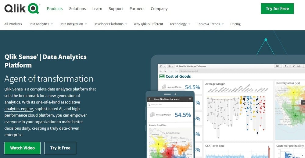
QlikView is one of the products provided by Qlik, data integration, and analytical company. QlikView was built for modern analytics, and you can use it to get insightful messages from a large chunk of raw data. You can bring all of your data from a variety of sources and unlock its full potentials with data tools provided by Qlik. This tool is an artificial intelligence-powered and comes with augmented reality capabilities. In terms of the visual appeal of the visualizations produced by QlikView, you’ll be wowed at the options available.
QlikView is a paid tool, but before making any form of payment, you can use the free trial version to test out its features and make sure it is the tool you want to spend your money on before parting ways with your money.
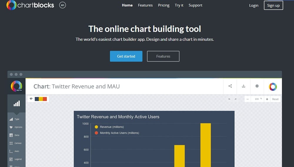
ChartBlocks
From the name of this data visualization tool, you can tell that it is a chart design tool. ChartBlocks pride itself on being the world’s easiest chart builder app that you can use to build charts in minutes. With this tool, you can import your data from a variety of sources, create customized charts, and even share it on your social media accounts. ChartBlocks provide you the opportunity to extensively customize your visuals to the level you want.
One thing you’ll come to like about ChartBlocks is its ease of usage and the quick steps required to create professional-looking charts. The data import wizard will guide you through the steps of importing required data, including importing data from different sources. This chart builder app is a paid tool that comes with a free plan with some limitations.
Data Visualization Tools for Coders
This section of the article will describe some of the best data visualization tools web designers and developers can use to display data in graphical form. They are perfect for displaying charts, maps, tables, and other visuals. Let take a look at 5 of them below.
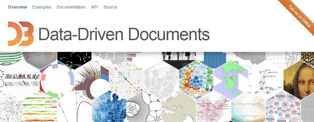
D3.js
D3.js is very popular among web designers. It is a JavaScript library for visualizing data with HTML, SVG, and CSS. With this tool, you can create interactive real-time data visuals meant for web browsers. D3.js is the successor of the Protovis framework and comes with it, full capabilities of modern browsers. One thing you will come to appreciate is that D3.js is that it is an open-source software with a BSD license – and thus, not tied to any proprietary rights.
This data visualization tool does not introduce new elements; it makes use of the standard HTML, CSV, and SVG elements to create eye-catchy and beautifully presented data visuals. How this data visualization tool works is simple; it binds data to DOM and then applies data-driven transformations to it.
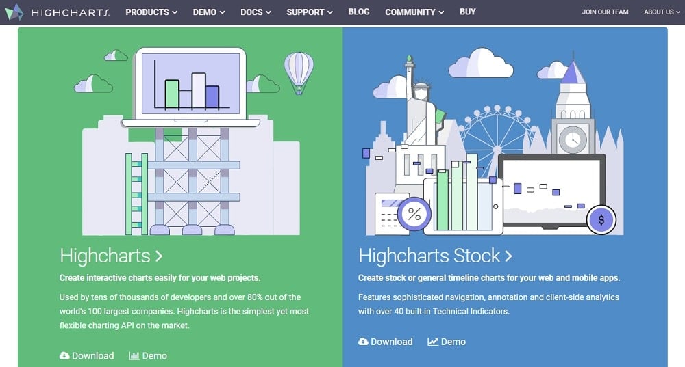
Highcharts
I have a memory of the Highcharts data visualization tool – it was the first data visualization tool I ever used as a Django developer presenting to present data visuals in the user dashboard of a SaaS MVP product I built for fun. I must confess, I love the tool. This tool makes the development of interactive charts easy for web designers. Highcharts has got many of the world’s biggest companies using their charts. However, one downside to this tool that will discourage many from using it is that it is free only for non-commercial usage. If you need it for business-related projects, you’ll need to get a license.
If you can afford the license, then the value you’ll enjoy cannot be overemphasized. With Highcharts, you can create any chart you like, including line, spline, area, areaspline, column, bar, pie, scatter, angular gauges, arearange, area spline range, columnrange, and polar chart. Very important is the fact that Highcharts is compatible with modern browsers.
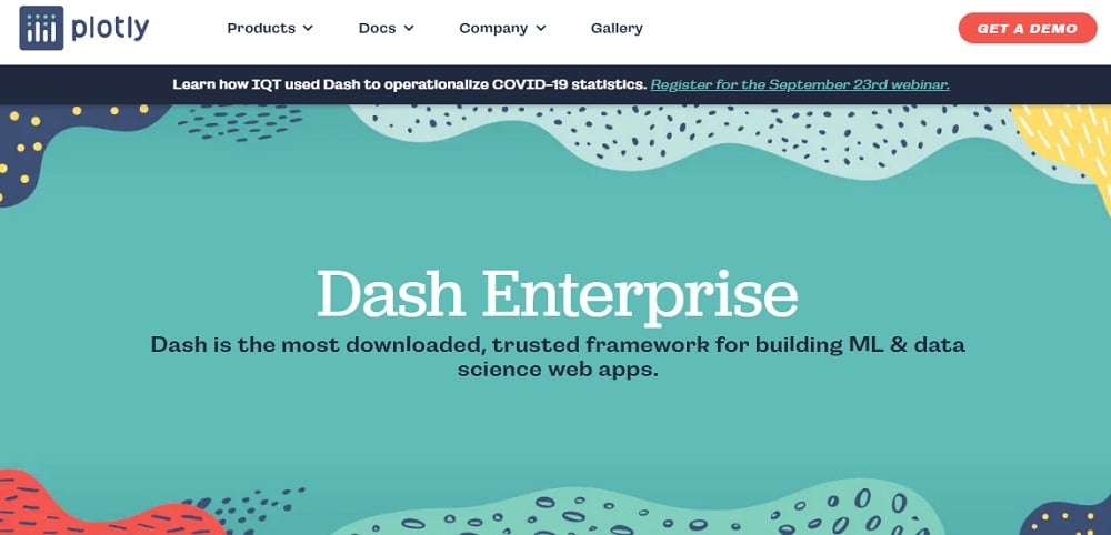
Plotly
Plotly has proven to be a force to reckoned with in the data science space, especially among web developers. Plotly records over 4 million downloads monthly. Plotly does not only have support for simple data visuals but also allows you to create complicated visuals. Plotly is a commercial product built onto the D3.js JavaScript library. However, it has been engineered to be more user-friendly and easy to use. One other feature of interest is its integration capabilities with popular data science programming languages, including Python, R, and Matlab.
If you’re looking forward to creating a dashboard that uses advanced analytics, then Plotly is one of the paid choices available to you – it has a free tier with limitations. The fact that it integrates well with some programming languages used in data science makes it a good choice.
ECharts
Are you looking for a visualization tool that is completely free to use and comes with a lot of customization options available? Then ECharts is one of the best options available. Echarts is a powerful chart builder and visualization library. ECharts is an incubation project at The Apache Software Foundation. ECharts makes use of the responsive approach, and as such, charts are displayed perfectly on all device sizes. This tool makes it easy for rapid construction web-based visualization.
You still have to take note of the fact that this project is still incubating. However, this does not mean that it is not worth using – in fact, it is feature-rich, and you will like it. This data visualization tool is perfect for multi-dimension data analysis.
FushionCharts
FushionCharts will provide you ready-to-use chart examples to get you started pretty quickly. Not only that, but it also has comprehensive documentation to help developers grasp its functionality. With this data visualization tool, developers can build beautiful web and mobile dashboards. This tool is a paid tool but has a free trial option for users. When using this tool, just know that you are in the right company as companies such as Google and Oracle are using their tools.
The FusionCharts suite comes with over 100 charts, gauges, choropleth, graph, and maps. Aside from charting, it is also a powerful tool for time-series data. One feature you will come to like about FusionCharts is that it allows users to export an entire dashboard – unlike many others that will allow you to export only charts.
Conclusion
Data in its raw form is meaningless,and you will find a hard time trying to make sense of it. By analyzing and representing it in visual formats, it becomes easier to get insight from it. While you can visualize data manually using a pen and paper, you are bound to make mistakes and distort details. For this reason, using a data visualization tool is the way to go, and you can make a choice from the options provided above.
Related,